.png)
A complete brand identity and 7-page marketing website, designed and built for a women's wellness studio launching in Hoi An with no photography, no booking system, and a 4-week deadline.
Client
Women's wellness studio, Hoi An, Vietnam
Role
End to end, discovery through Webflow build
Timeline
3 weeks
Tools
Notion, Figma, Webflow
Outcome
Full brand identity system and 7-page responsive prototype delivered on deadline
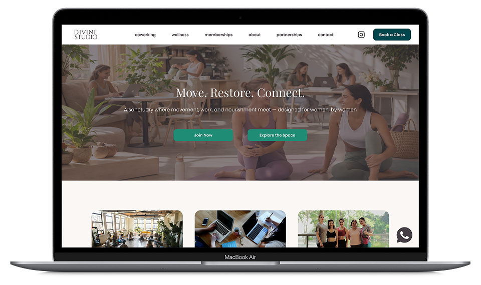
A women's wellness studio was opening in Hoi An with no brand identity, no website, and an opening date four weeks away. The business was not a gym, a coworking space, or a café. It was all three, and the site needed to communicate that integrated experience clearly without overwhelming visitors or diluting the core conversion goal.
The constraints were significant. No professional photography existed. The booking system was undecided. The audience was bilingual. And the entire project, from discovery to high-fidelity prototype, needed to be completed in weeks.
DECISION 1
Build the brand identity system before wireframing.
RATIONALE &TRADEOFF
The client had directional brand ideas but no formal system. Without locking the brand first, every design decision would have been provisional and required rework at the prototype stage.
Added significant time to the front of the project, which felt risky given the tight timeline. In practice, having the system defined made every subsequent decision faster and more confident.
DECISION 2
Handle the missing booking system with a sitewide modal rather than a holding page.
RATIONALE &TRADEOFF
Linking 15 or more CTAs across 7 pages to a separate holding page would have felt disjointed and communicated incompleteness. A modal keeps users in the experience, feels intentional rather than broken, and can be replaced with a real booking flow the moment an integration is confirmed, with no structural changes to any page.
A modal requires JavaScript and adds a component to build and maintain. A holding page would have been simpler. The UX gain justified the complexity.
DECISION 3
Scope the site strictly to the marketing layer and temporarily exclude the functional layer.
RATIONALE &TRADEOFF
The functional layer, class scheduling, booking management, and member portal, depends entirely on which third-party integration the client chooses. Designing booking flows before that decision was made would have produced work that needed to be discarded. Drawing a clear line between marketing and functional layers meant the site could launch and convert immediately.
Users cannot complete a transaction at launch. Mitigated by the WhatsApp modal providing a low-friction interim booking channel appropriate for a community-first brand at the pre-launch stage.
DECISION 4
Build bilingual toggle infrastructure without completing the full translation.
RATIONALE &TRADEOFF
A full bilingual build was beyond the scope and timeline. Omitting the toggle entirely would have required a navigation redesign later. Building the placeholder now means the toggle can be activated and linked to a translated duplicate of the site at any point, without touching the navigation design.
The toggle exists in the design but does nothing at launch. A Loom walkthrough was prepared for the client explaining how to activate it in Webflow when ready.
The homepage moves visitors from brand introduction through to conversion without a dead end. Hero, three business pillars, class previews, social proof, membership teaser, and a final CTA, each section earns its place in the sequence.
.png)
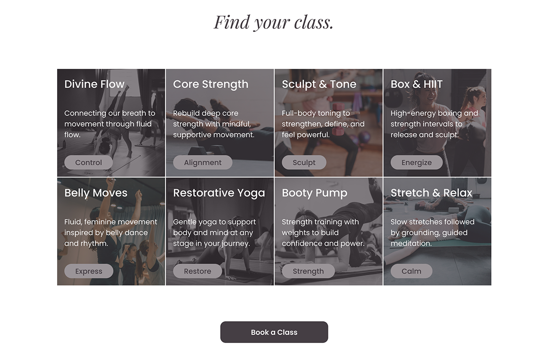
Eight class cards with category tags and a dedicated Life Stages section for high energy, rest and restore, and graceful years. The structure communicates that the studio is genuinely for all women, not just a single demographic.
Six pricing options, an inclusions checklist, testimonials, and an FAQ accordion in sequence. Every objection is handled before the visitor reaches the final CTA.
.png)
All booking CTAs across all 7 pages trigger a single branded modal with a WhatsApp CTA and email fallback. Users stay in the experience. The modal can be replaced with a live booking integration without touching any page structure.
.png)
Full system delivered in 3 weeks
Brand identity, 7-page high-fidelity prototype, site architecture, CTA map, user flow diagram, and Figma handoff brief.
WCAG 2.1 AA compliant
All color combinations documented against accessibility standards. Typography system established across 7 levels with consistent REM values.
Zero dead-ends
Site architecture serves three distinct personas across 7 pages with clear conversion pathways from Instagram discovery to WhatsApp booking inquiry.
Delivered without a client
When the original client withdrew mid-project, the full process was completed independently under a fictional rebrand, demonstrating ownership and the ability to deliver without external validation.
Building the brand identity before touching any page layouts was the single best decision of the project. Every design choice after that point had a system to reference, which made the prototype stage significantly faster and more confident.
Scope expanded organically through discovery. Managing that expansion while protecting the timeline required explicit scope conversations and a formal project agreement, something I would establish earlier on future engagements.
Copy decisions shaped the design more than expected. Choosing the right headline for a section changed how the entire layout felt and what visual hierarchy made sense beneath it. For a brand this values-driven, language and design are inseparable. On future projects of this kind, I would approach both simultaneously from the start.
This is a real client project. The client withdrew before launch. The full process was carried through to demonstrate end-to-end capability without external validation.

