.png)
A unified school management platform designed for four distinct user roles, consolidating fragmented systems into a single interface where every user completes their tasks without assistance.
Client
Self-directed, informed by 6 years of education administration experience
Role
Solo, research through high-fidelity prototype and user testing
Timeline
8 weeks
Tools
Figma, Miro, Remote and In-Person Testing
Outcome
100% task completion across 4 distinct user roles in usability testing
Schools rely on multiple disconnected platforms to run daily operations. Administration uses one system, teachers use another, parents use a third. The result is fragmented workflows, redundant data entry, and users who are forced to learn and manage several tools simultaneously.
The consequences are not just inefficient. Attendance must be completed by strict morning deadlines while teachers are actively managing classrooms. Administrative staff handle time-sensitive tasks under constant interruption. Parents have no single place to track their children's schedules, grades, or communications. Students navigate systems that were not designed with them in mind.
No platform serves all four user groups effectively. This project set out to design one that does.
DECISION 1
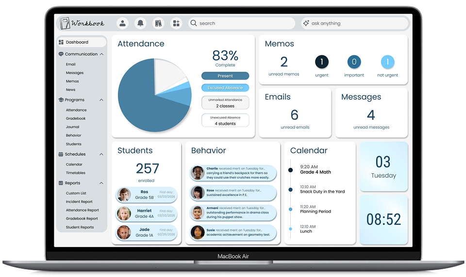
Make attendance status the primary dashboard signal.
RATIONALE &TRADEOFF
Morning attendance is legally critical for student safety. A large visual at the top of the dashboard immediately prompts teachers to complete it and shows administrators which students remain unaccounted for, enabling rapid parent contact.
A pie chart reads as visually dated compared to more modern alternatives. Functional urgency and institutional familiarity outweighed aesthetic considerations. A less familiar format could reduce visibility at the moment it matters most.
DECISION 2
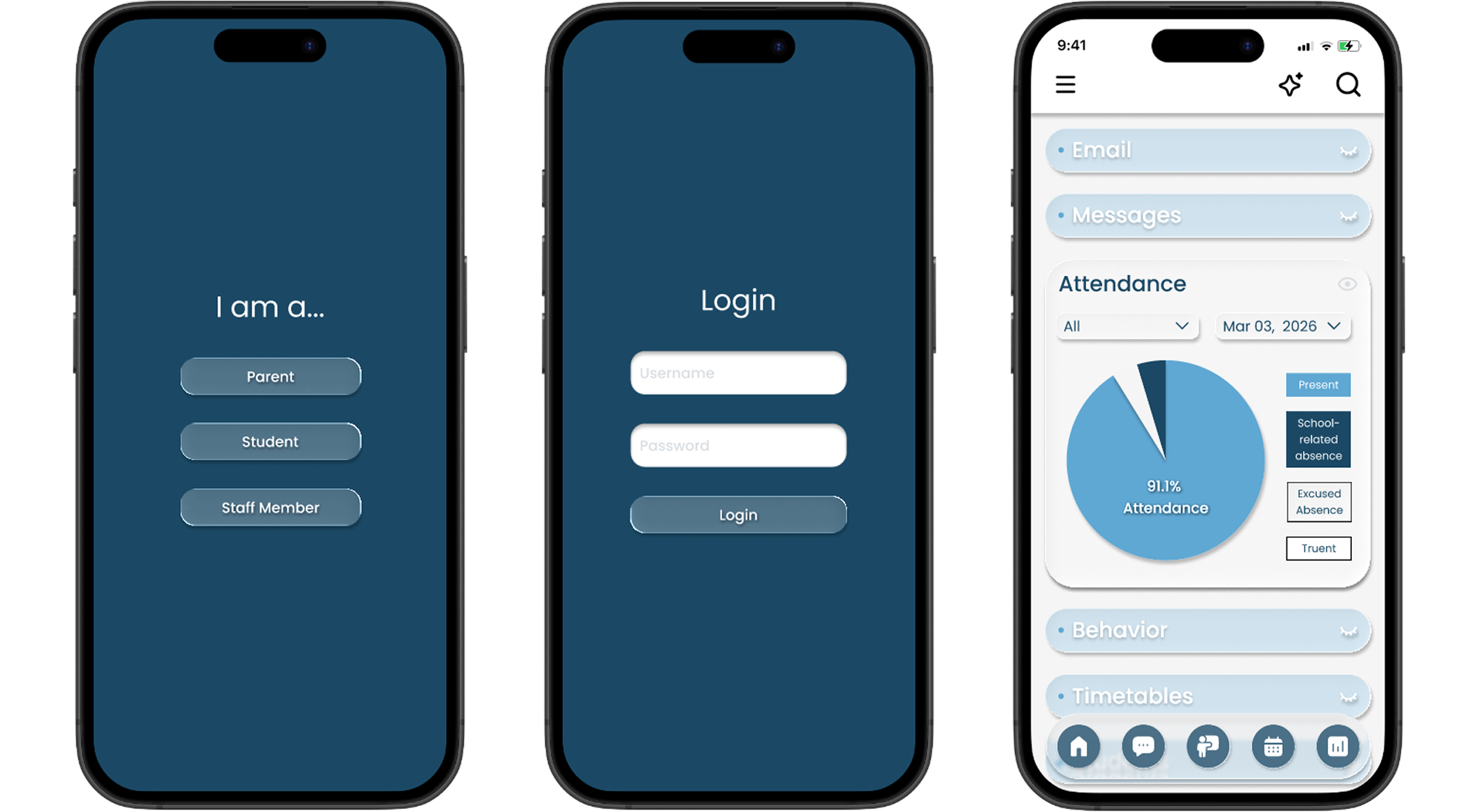
Hide message content and show only unread counts and urgency indicators.
RATIONALE &TRADEOFF
Sensitive student information should not be visible when students are near teacher computers. Teachers can see what requires attention without exposing confidential communications in an open classroom environment.
Accessing message content requires an additional click. The privacy protection for students in vulnerable situations justifies that friction.
DECISION 3
Add student awareness widgets directly to the dashboard.
RATIONALE &TRADEOFF
Staff visibility into recent enrollments and behavior patterns improves welcoming behaviors and pastoral care. When positive behaviors are visible across classes, staff can acknowledge students they do not directly teach, reinforcing school culture and student confidence.
Added visual density to the dashboard. The pastoral benefit, student wellbeing, inclusive culture, and staff coordination, outweighed the preference for a more minimal layout.
The dashboard surfaces the most time-sensitive information immediately: attendance status, unread message counts, recent enrollments, behavior highlights, and calendar. Each element earns its place based on daily task priority, not visual preference.
The attendance flow was reduced to a filterable roster with status controls and an activity log confirming each action. Teachers complete it without leaving the dashboard, without confusion, and without disrupting the classroom.
%201.png)
The responsive mobile version preserves all core interactions with touch-optimized controls. Teachers working away from their desks and parents checking in from their phones get the same clarity as the desktop experience.
100% task completion in testing
Every participant completed unfamiliar tasks independently, without assistance, across all four user roles.
One platform replaces three to five
The unified system eliminates the need for separate administration, teacher, and parent platforms, reducing subscription costs and cognitive load
Attendance flow reduced to 3 steps
The most time-critical daily task was redesigned to be completed quickly, under distraction, before the morning deadline.
Validated through 12 terations
Continuous testing with real education professionals refined the design to a point where only one additional change was requested after final validation.
Deep iteration in the ideation phase paid off. Committing to extensive hand sketching before moving to high-fidelity prototypes meant the information hierarchy was genuinely resolved before visual decisions were made.
The most unexpected finding was that simpler design consistently outperformed more complex interactions in testing. Features that seemed helpful in theory created friction in practice. Every element that was removed made the remaining ones more effective.
If I were to continue this project, I would add an attendance confirmation overlay to close the loop for teachers at the moment they complete the task. A small moment of confirmation reduces the cognitive residue of an unfinished action, which matters when the next 30 minutes involve managing a classroom.
This is a self-directed project grounded in 6 years of firsthand education administration experience. The problem, the personas, and the constraints are drawn directly from real systems I built and managed in practice.

