Temu UX Audit

UX audit of high-traffic shopping app: 9 usability issues identified with evidence-based redesigns.

Heuristics

Accessibility

I.A.

Critical Thinking

Cognitive Load

UX Design

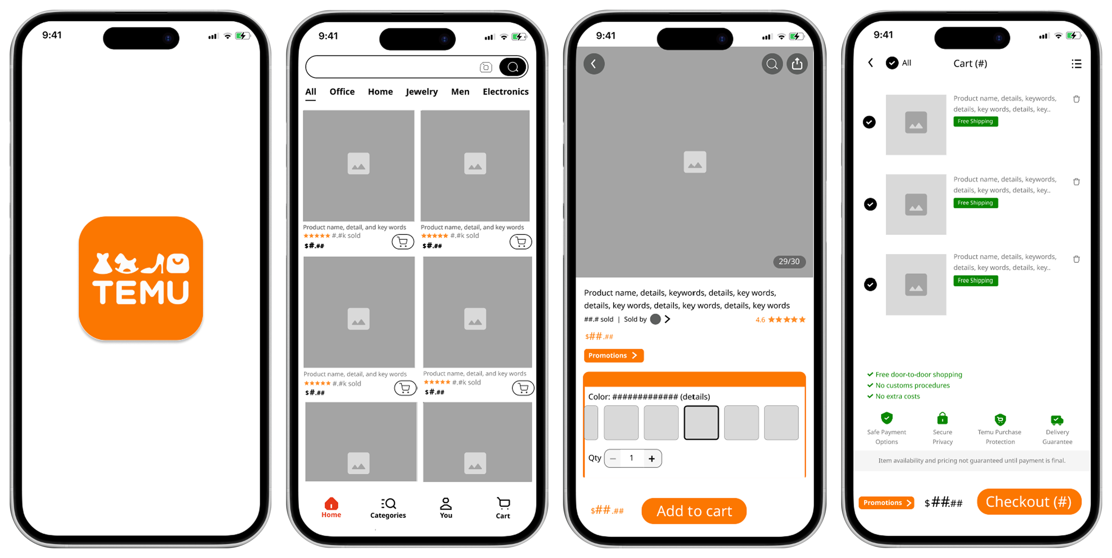
4 iPhones displaying the user flow of the Temu UX Audit Redesign

Project at a Glance

Client

Self-directed audit of an existing live product

Role

Solo, heuristic evaluation through mid-fidelity redesign and guerrilla testing

Timeline

1 week

Tools

Figma, Miro, Pen & Paper

Outcome

9 usability violations identified & resolved across core purchase flow

Problem

E-commerce platforms are built to convert, and promotional content is a legitimate and proven tool for driving purchase behavior. The challenge is not promotion itself. It is promotional architecture.

Temu's mobile app surfaces promotional content at every stage of the purchase flow simultaneously, from entry overlays through to checkout. When promotion competes with navigation at every step rather than supporting it, the result is increased cognitive load, slower task completion, and higher abandonment rates, particularly among users with ADHD, dyslexia, visual processing differences, or limited technical literacy.

The design question this project set out to answer was not whether to include promotion, but how to structure it so that business goals and user goals are not working against each other.

Goals

  • Conduct a structured heuristic evaluation of Temu's mobile purchase flow against Nielsen's usability principles
  • Identify and document violations with a focus on accessibility impact for users with cognitive and visual processing challenges
  • Redesign the core purchase flow, from product browsing through checkout, to reduce cognitive load and improve task completion
  • Validate the redesign through guerrilla testing and qualitative feedback

Contraints

  • Conduct a structured heuristic evaluation of Temu's mobile purchase flow against Nielsen's usability principles
  • Identify and document violations with a focus on accessibility impact for users with cognitive and visual processing challenges
  • Redesign the core purchase flow, from product browsing through checkout, to reduce cognitive load and improve task completion
  • Validate the redesign through guerrilla testing and qualitative feedback

Process

5  |  Iterate

Validated the redesign through guerrilla testing. Refined device sizing and responsive behavior after identifying that testers needed guidance adjusting view screens for accurate prototype evaluation.

1  |  Discover

Walked through Temu's full purchase flow conducting a heuristic audit, documenting violations of the aesthetic and minimalist design principle across every stage from entry to checkout.

2  |  Define

Synthesized findings and framing the problem through an accessibility lens informed by a special education background. Identified how visual clutter creates specific barriers for users with challenges.

1  |  Research

Walked through Temu's full purchase flow conducting a heuristic audit, documenting violations of the aesthetic and minimalist design principle across every stage from entry to checkout.

2  |  Define

Synthesized findings and framing the problem through an accessibility lens informed by a special education background. Identified how visual clutter creates specific barriers for users with challenges.

3  |  Ideate

Progressed from early sketches to wireframes, exploring approaches to simplifying information hierarchy while maintaining business objectives rather than simply removing promotional content.

2  |  Define

Synthesized findings and framing the problem through an accessibility lens informed by a special education background. Identified how visual clutter creates specific barriers for users with challenges.

3  |  Ideate

Progressed from early sketches to wireframes, exploring approaches to simplifying information hierarchy while maintaining business objectives rather than simply removing promotional content.

4  |  Prototype

Created a mid-fidelity redesign of streamlined purchase flow, with simplified promotions, removed redundancy, clarified checkout labels, and reduced visual distractions.

3  |  Ideate

Progressed from early sketches to wireframes, exploring approaches to simplifying information hierarchy while maintaining business objectives rather than simply removing promotional content.

4  |  Prototype

Created a mid-fidelity redesign of streamlined purchase flow, with simplified promotions, removed redundancy, clarified checkout labels, and reduced visual distractions.

5  |  Iteration

Validated the redesign through guerrilla testing. Refined device sizing and responsive behavior after identifying that testers needed guidance adjusting view screens for accurate prototype evaluation.

4  |  Prototype

Created a mid-fidelity redesign of streamlined purchase flow, with simplified promotions, removed redundancy, clarified checkout labels, and reduced visual distractions.

5  |  Iteration

Validated the redesign through guerrilla testing. Refined device sizing and responsive behavior after identifying that testers needed guidance adjusting view screens for accurate prototype evaluation.

1  |  Research

Walked through Temu's full purchase flow conducting a heuristic audit, documenting violations of the aesthetic and minimalist design principle across every stage from entry to checkout.

Key Decisions

Consolidate Promotions

Promotional content serves a real and measurable business function. The issue was not its presence but its placement. When promotion appears at every stage of the purchase journey simultaneously, it competes with the actions it is trying to drive. Consolidating promotions into a single designated zone preserves their visibility and impact while reducing the cognitive interference they create when distributed across every screen.

Consolidated promotion has less touchpoint frequency than distributed promotion. The hypothesis is that higher task completion rates and lower abandonment offset the reduction in impression volume. This would be validated through A/B testing before any production decision.

Restructure Urgency Messaging Rather Than Remove It

Urgency signals are a proven conversion mechanism across e-commerce markets globally. The problem with Temu's implementation was not urgency itself but the density and frequency of competing urgency signals on a single screen. Redesigning the hierarchy so that one clear urgency signal appears at the right moment in the flow, rather than five competing ones across the same view, makes each signal more effective rather than less.

Reduced urgency density may lower impulse conversion at individual touchpoints. The argument is that a user who completes a purchase with confidence is more valuable long-term than a user who abandons due to overwhelm.

Simplify the Checkout Flow to Reduce Abandonment

Checkout is where conversion either happens or fails. Adding cross-sell and promotional elements at this stage introduces decision fatigue at the exact moment the user needs the least friction. A clean checkout does not eliminate business goals. It prioritizes completion over last-minute upsell, which the data consistently supports as the higher-value outcome.

Reduced upsell opportunity at checkout. Justified by abandonment reduction data, which consistently shows that checkout complexity is one of the primary drivers of lost sales.

Design Solutions

Remove the Barrier Before the Experience Begins

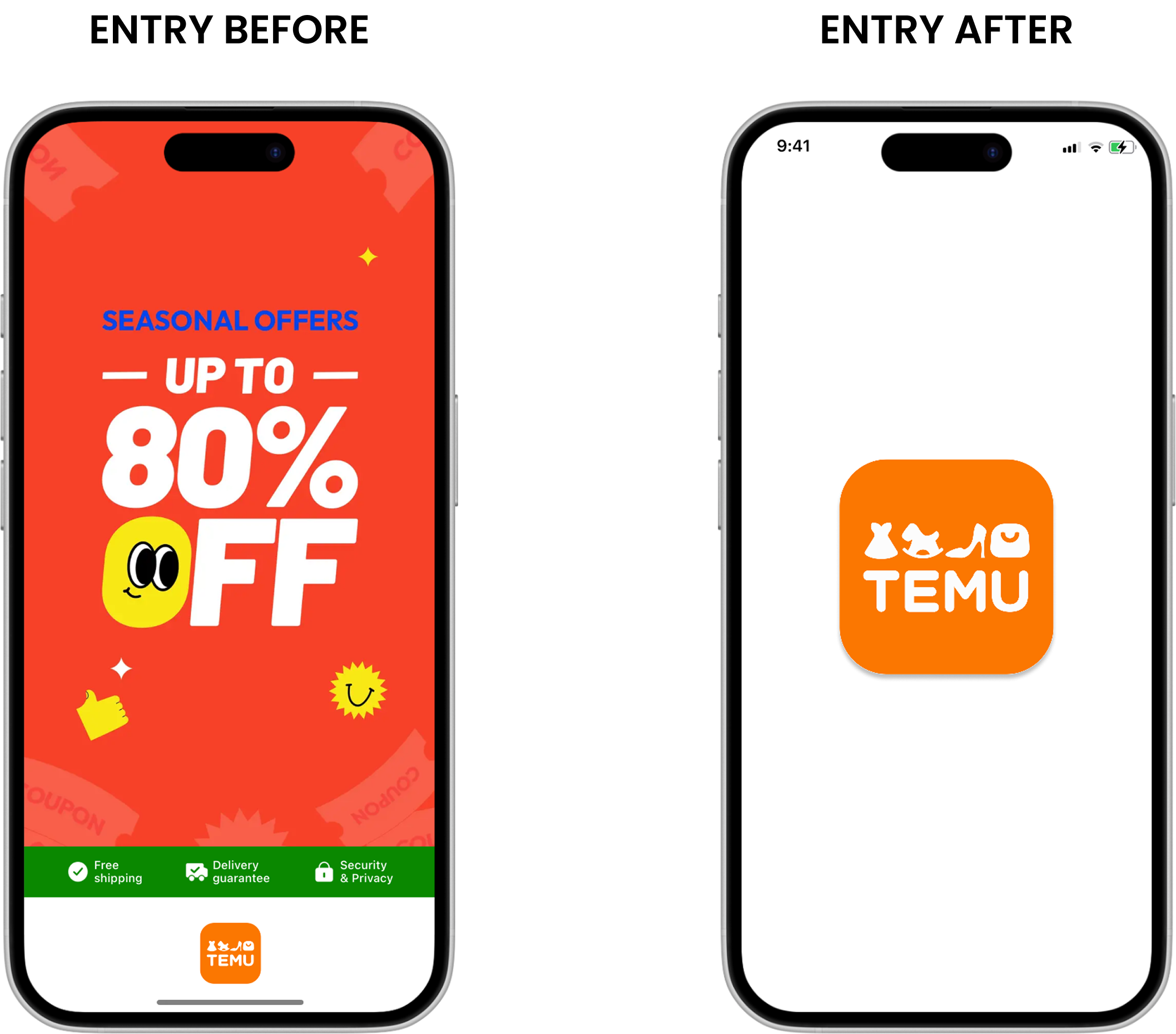
The original entry screen opens with a full-screen pop-up offering 80% off, blocking access to the product entirely. The redesign removes the entry overlay. Users land directly in the product experience, which is where they came to be.

A before and after of the Temu app upon loading, showing the redesign of the welcome screen

Clean Hierarchy That Focuses on the Product, Not the Promotion

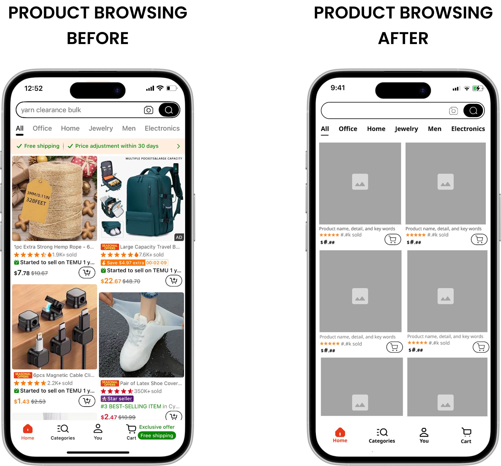
Competing colors, urgency labels, star seller badges, installment payment messaging, and percentage-off text were removed from individual product cards. The redesigned cards surface the product image, name, price, and rating. Everything the user needs to make a decision, nothing that competes with it.

A before and after of the Temu app, showing the redesign of the browsing screen

Fewer Elements. More Confidence.

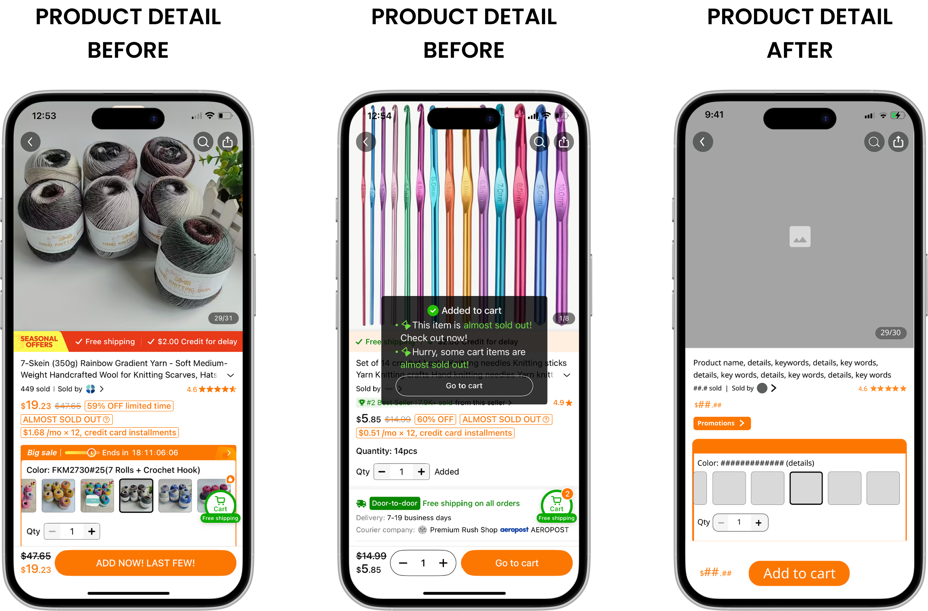
The countdown timer and redundant shipping and credit banners were removed from the product detail page. The information that remains, product details, pricing, and the add to cart action, is presented in a clear, uninterrupted hierarchy.

A before and after of the Temu app, showing the redesign of the product detailscreen

A Calm Checkout Builds Completion Confidence

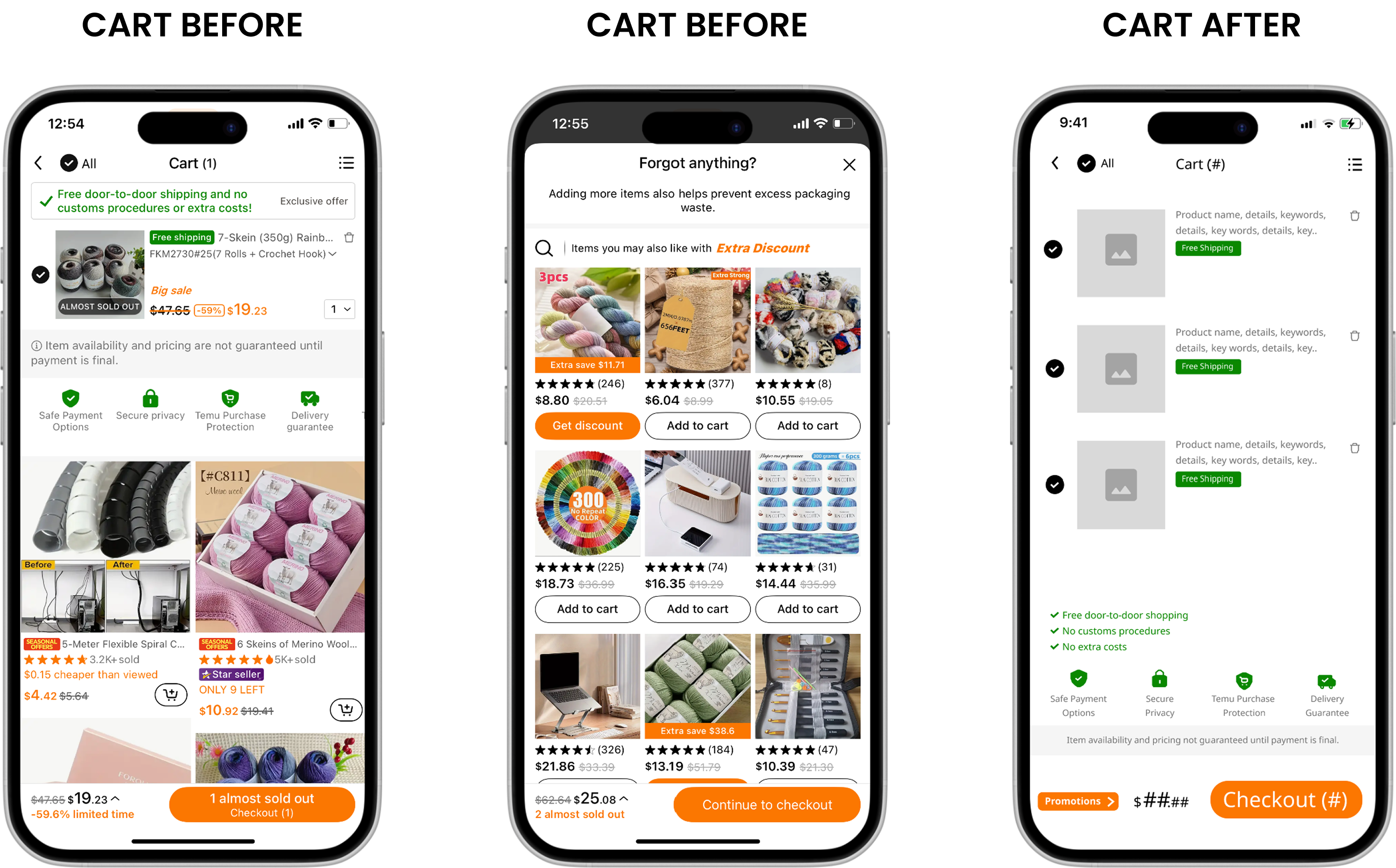
Almost sold out overlays and urgent checkout messaging were removed from the cart entirely. The redesigned checkout is minimal, consistently labeled, and visually predictable. Users who reach this stage are close to completing a purchase. The design stops working against them.

A before and after of the Temu app, showing the redesign of the shopping cart layout

Outcomes

9 Usability Violations Identified and Resolved

Each violation was documented against established heuristic principles, with a specific redesign decision addressing the root cause rather than the symptom.

Cognitive Load Reduced Throughout User Flow

Entry, browsing, product detail, and checkout were each redesigned to surface only the information required for the next user decision, removing everything that competed with it.

Accessibility Barriers Addressed Directly

The redesign specifically targeted barriers for users with ADHD, dyslexia, visual processing challenges, and limited technical literacy, groups that existing e-commerce design conventions consistently underserve.

What This Project Confirmed

The most significant reframe in this project was moving from the instinct to eliminate promotional content to the discipline of restructuring promotional hierarchy. Elimination is easy to justify from a usability perspective but ignores legitimate business requirements. The more interesting and more useful design question is how to make promotion work better for both the business and the user simultaneously.

Heuristic evaluation revealed that the violations were not simply aesthetic. They created genuine barriers for users with cognitive and processing differences, a group that e-commerce platforms consistently underserve. Designing for that range of users is not in conflict with commercial goals. In many cases it strengthens them, because the same clarity that helps a user with ADHD complete a purchase also helps a time-poor user on a mobile device do the same.

The finding that simplification improved the business case alongside the user experience was the most useful outcome of the project. It is the argument worth making to any stakeholder who assumes that UX and conversion are in tension.

This is a self-directed audit and redesign concept for a live commercial product. No internal Temu data or business metrics were used. The redesign proposals are hypotheses intended to be validated through further A/B testing and data analysis before any production recommendation would be made.