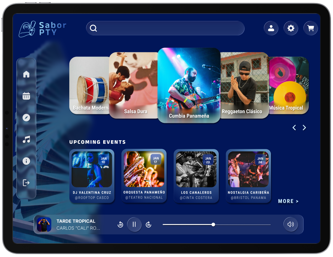
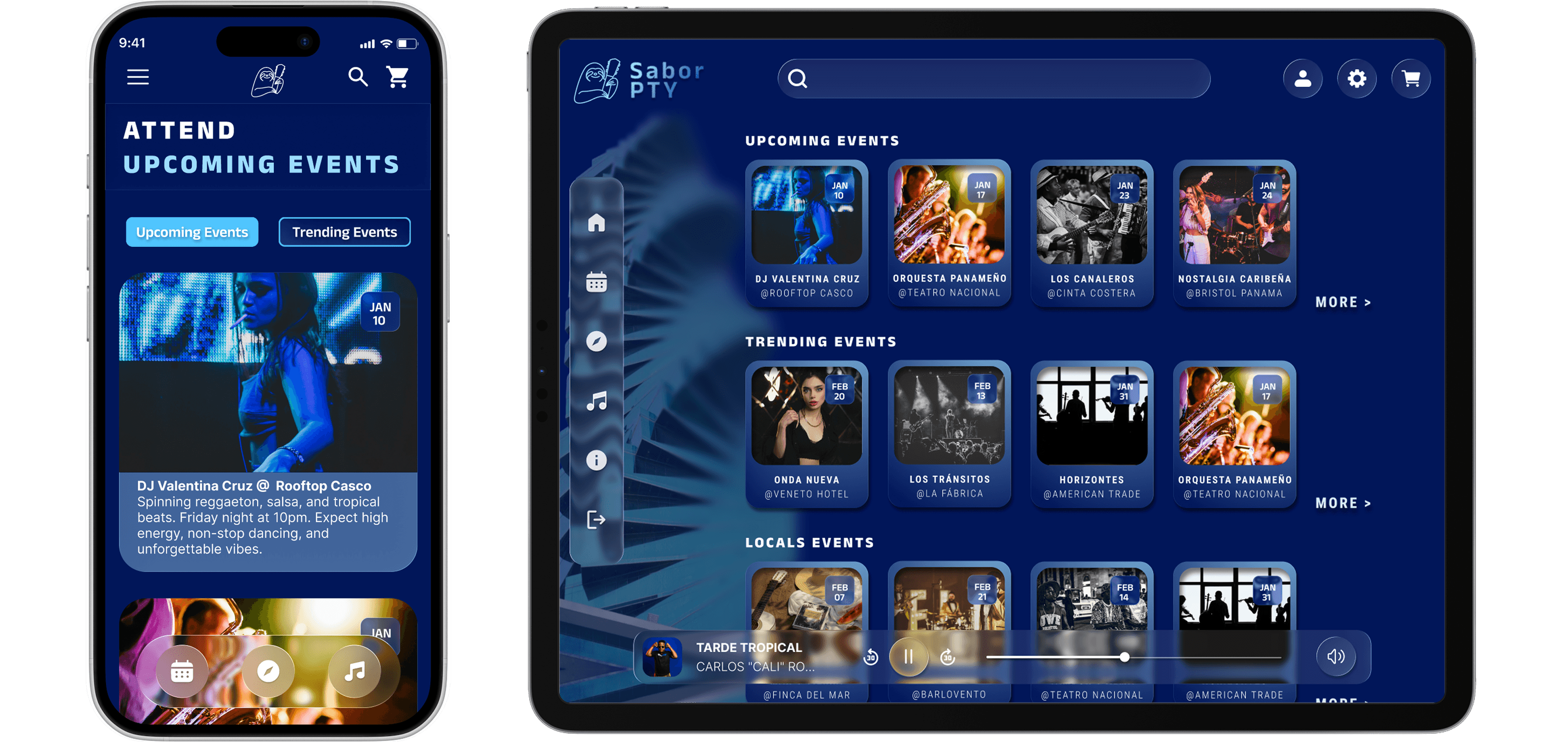
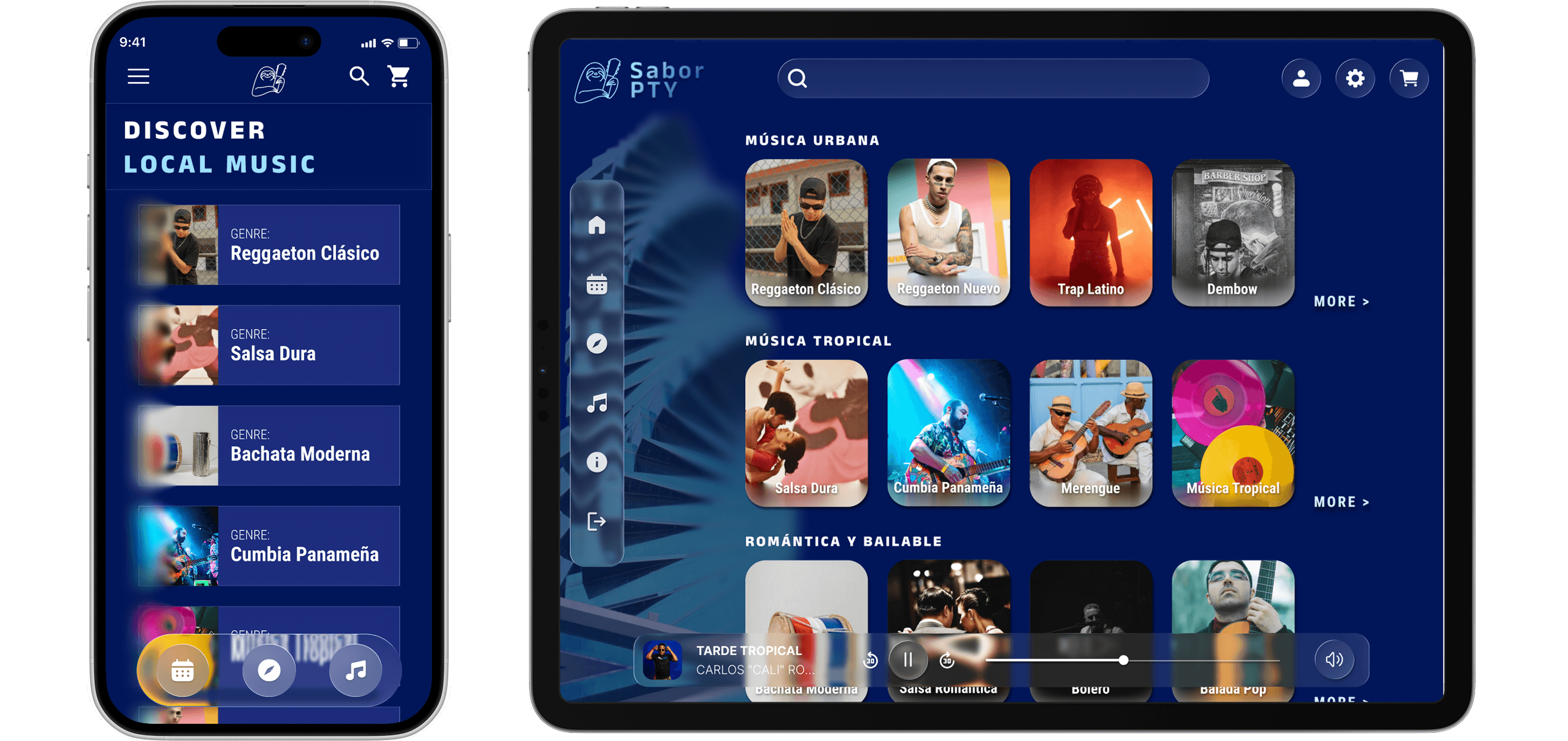
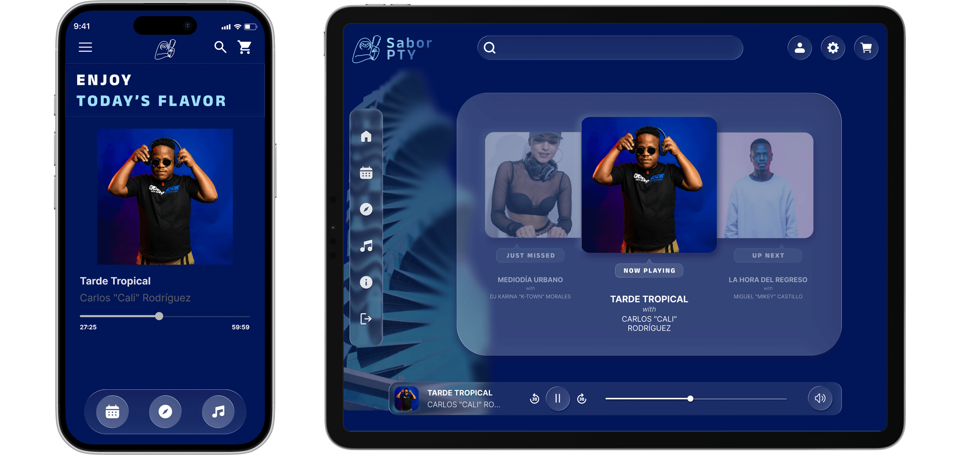
Advanced prototyping is most valuable when it is in service of a real interaction problem, not a demonstration of technical capability. The carousel navigation, expandable side navigation, and integrated player were not built to showcase Figma skills. They were built because the discovery behavior the platform needed to support required them.
The most useful finding from testing was that desktop space enables detail without overwhelm. The instinct in responsive design is often to simplify aggressively for larger screens. On a discovery platform, more screen space is an opportunity to surface more context alongside the primary content, which is what users actually want when they are planning an evening out.
If I were to continue this project, I would prioritize component consistency across platforms. The mobile and desktop experiences diverged more than intended during iteration, and unifying the component library would be the first step before any additional feature development.
This is a visual design concept. It is not a full UX case study with structured research, formal testing, or a client brief. It demonstrates UI design craft, design systems thinking, and advanced prototyping capability within a concept grounded in a real and observable problem.