.png)
A music discovery platform connecting Panama City locals, expats, and tourists with live events, local artists, and radio streaming, built as a multi-sided ecosystem serving listeners, artists, and administrators.

Client
Brief-provided visual design concept
Role
Solo, research through high-fidelity interactive prototype
Timeline
2 weeks
Tools
Figma, Advanced Prototyping, Design Systems, Variables
Outcome
Multi-sided UI concept for Panama City's local music and events ecosystem
Panama City has a thriving local music scene and no centralized way to find it. Locals discover events through personal networks. Expats and tourists navigate language barriers and cultural unfamiliarity with no reliable starting point. Emerging artists lack visibility outside their immediate circles.
The fragmentation has real consequences. Music lovers miss events that would have mattered to them. Local artists lose attendance and economic support they cannot afford to lose. Cultural exchange that could happen between locals, expats, and visitors does not, because the infrastructure for it does not exist.
This project set out to design a platform that solves the discovery problem for all three user groups simultaneously, while creating a sustainable ecosystem that supports local artists and local radio rather than competing with them.
DECISION 1
Design for three user groups simultaneously rather than a single audience.
RATIONALE & TRADEOFF
A platform that only serves listeners is an event listing. A platform that serves listeners, artists, and administrators creates a sustainable ecosystem. Artists need promotion, listeners need discovery, and administrators need content management tools. Designing for all three from the start creates product-market fit that a single-sided approach cannot match.
Increased design complexity and development scope. The stronger ecosystem value and competitive differentiation justified both.
DECISION 2
Integrate local radio streaming rather than limiting the platform to event discovery.
RATIONALE & TRADEOFF
Discovery does not stop when an event ends. Connecting users to local radio stations playing the genres and artists featured on the platform creates a continuous engagement loop and drives ticket sales between event cycles. It also supports local broadcasting rather than competing with it.
Radio streaming adds development complexity for a streaming integration. The enhanced value proposition and ongoing user engagement between events justified the technical investment.
DECISION 3
Apply a glassmorphism visual system inspired by stage lighting rather than a minimal aesthetic.
RATIONALE & TRADEOFF
The target audience is young, culturally engaged, and expects a visually distinctive experience. A minimal interface would have been technically safer but culturally wrong for a platform built around live music energy. The stage-lighting-inspired blue palette and glass effects create a brand identity that feels native to the scene it represents.
A trend-driven aesthetic may date faster than a minimalist approach. Establishing cultural relevance with the primary audience early justified the design risk.
The homepage surfaces top navigation with search, an expandable side navigation, rotating genre carousels, upcoming events, and an integrated music player bar simultaneously. The layout is dense by design. Music discovery is an exploratory behavior, and the interface supports that without forcing a linear path.
On mobile, events scroll vertically with top filters for quick scanning during a commute or lunch break. On desktop, category-based scrollable sections with refined card design support the more deliberate browsing behavior of a user planning their week. The same information, structured for two different use contexts.
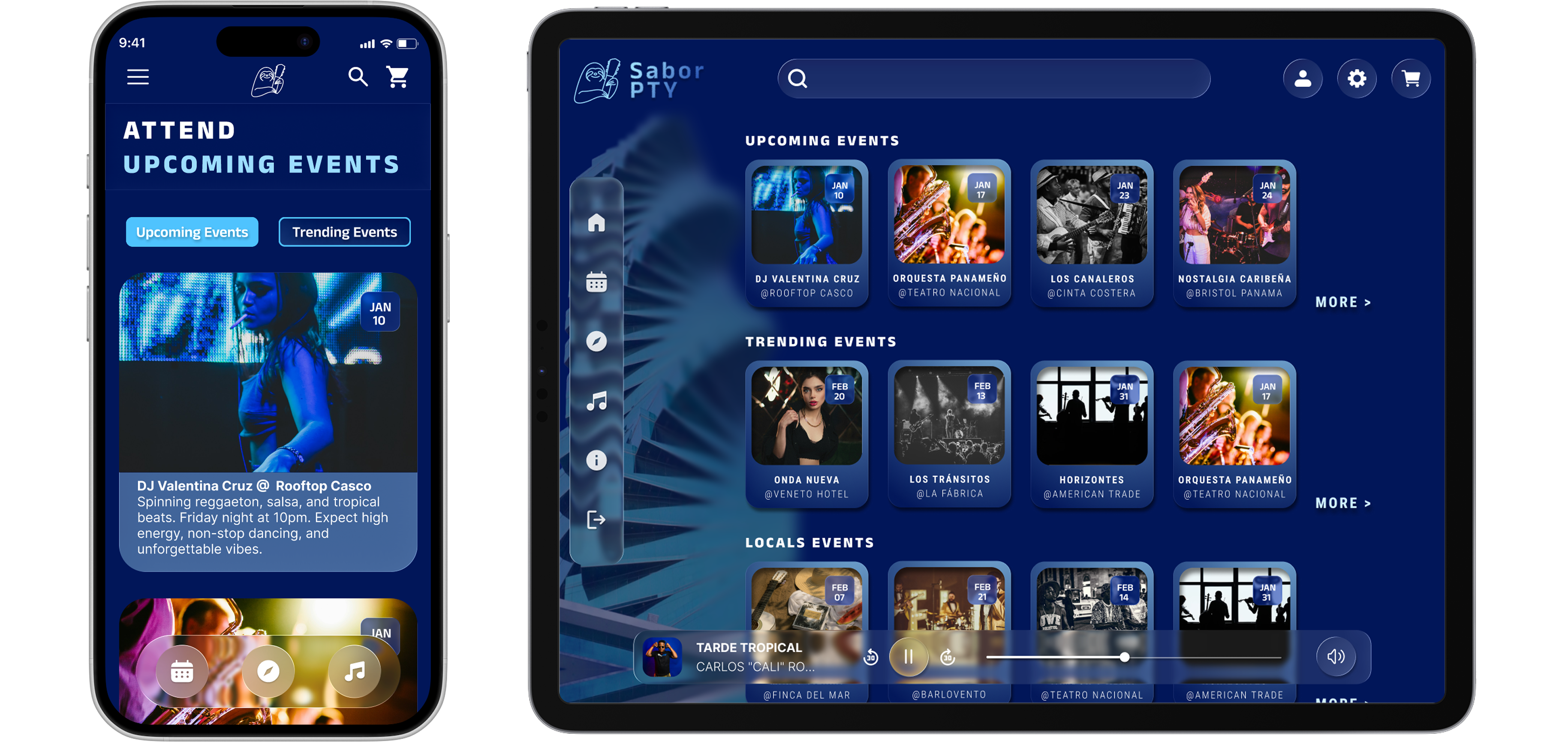
Genre selection cards on mobile and scrollable category sections on desktop introduce users to Panamanian musical styles, not just upcoming events. For expats and tourists unfamiliar with típico panameño or local Latin subgenres, this is where cultural discovery actually begins.
.png)
The mobile view delivers a standard music player interface. The desktop view expands to show the program schedule and artist information alongside the stream, turning passive listening into active discovery. Featured artists on air link directly to their profiles and upcoming events.
.png)
Multi-sided platform concept delivered
Listener, artist, and administrator experiences designed within a single cohesive system, extended beyond the original course scope with radio streaming and ticket purchasing flows.
Scalable design system built in Figma
Component variables for navigation states, carousel interactions, and player controls enable the system to scale across screens and feature additions without structural rework.
Distinctive and clear visual design praise
Informal testing validated the navigation patterns and brand identity. Users found the platform visually engaging and the core discovery flows intuitive despite the interface density.
Desktop space used as a design asset
The desktop layout was refined to leverage additional screen real estate with expanded program schedules, richer card detail, and category-based browsing sections that would be impractical on mobile.
Advanced prototyping is most valuable when it is in service of a real interaction problem, not a demonstration of technical capability. The carousel navigation, expandable side navigation, and integrated player were not built to showcase Figma skills. They were built because the discovery behavior the platform needed to support required them.
The most useful finding from testing was that desktop space enables detail without overwhelm. The instinct in responsive design is often to simplify aggressively for larger screens. On a discovery platform, more screen space is an opportunity to surface more context alongside the primary content, which is what users actually want when they are planning an evening out.
If I were to continue this project, I would prioritize component consistency across platforms. The mobile and desktop experiences diverged more than intended during iteration, and unifying the component library would be the first step before any additional feature development.
This is a visual design concept. It is not a full UX case study with structured research, formal testing, or a client brief. It demonstrates UI design craft, design systems thinking, and advanced prototyping capability within a concept grounded in a real and observable problem.

